As one of my creativity goals for CAS this year was to develop my drawing skills, I started using procreate. This app allowed me to draw liberally and use multiple mediums to extend my artistic range.
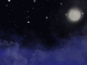
My first artwork using procreate was a landscape of the sky at night. I started by setting a dark black background and begin layering to create a more natural flow to the work as a whole. By using layers, I was able to erase or add any elements without changing or having to redo the artwork. I attempted to use some blurring around the moon to create a halo effect to indicate it is a source of light. I added a few stars in the sky to mimic the night sky but could have added smaller and more frequent white spots as the larger “stars” do not compliment the piece. Some improvements could have been made to this artwork, however, as this was my starting piece, I was content.
Artwork #1 on Procreate
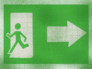
The second drawing I attempted to make was a more creative work in which I would draw an exit sign with a person running the opposite way. I decided to make this piece as I wanted to illustrate the desire to run away from responsibilities at the start of the school semester. Similar to my first artwork, I started off with a solid background color (white) and added multiple layers throughout. As I was getting comfortable with the app, I wanted to use some different features. One feature that I predominantly used throughout this artwork was straight lines. By drawing a line and holding it for 3 seconds, the line would click into a straight line. This allowed me to get all the straight lines seen throughout this sign. Additionally, I wanted to start exploring the skill of highlights and shadows. I attempted this by adding some lighter streaks of white on the sign, however, to improve this skill, I would focus on only having one highlight by choosing the direction of my light source. I also wanted to make the sign look dirty, thus I added some splashes of dark green at random.
Artwork #2 on procreate
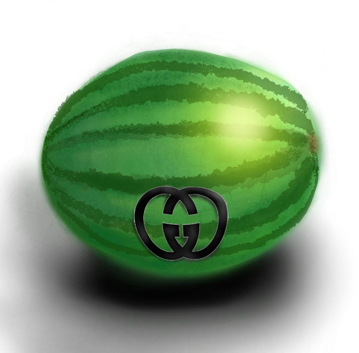
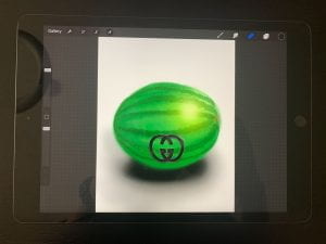
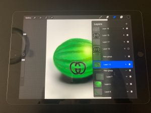
For my most recent artwork, I decided to use a muse and draw a semi-realistic watermelon. I attempted mixed media by adding a Gucci logo to reflect the materialistic world we live in and how everything can be branded. I continued with the layering, making use of an array of brushes and blurring to create a more realistic looking watermelon. I used highlights and shadows for a 3D effect which I found worked fairly well in my drawing.

LEARNING OUTCOMES
For my learning outcomes in my creativity journey, I was able to develop my artistic skills. We can see this through my progression over time between the three drawings, as some skills were already improving by the last artwork. I was able to make use of highlights and shadows more effectively to draw a more realistic watermelon. Additionally, I showed my commitment and perseverance to developing my artistic skills as I spent many hours doing so, as reflected by my works. Additionally, there was some growth in my learning, as I started to expand on the tools and elements I used to create my drawings. Generally, I have felt less stressed as I utilize some of my time during the day to dedicate to drawing. I will continue working on this goal as I strive to complete 4 drawings by the middle of September that I am satisfied with.
