Last year, Luca and I had won the 2018-2019 cover competition and produced a satisfying yearbook cover design encompassing the theme of “Take me back” in which, we decided to adopt a design including polaroids and pictures of the many different activities around the school to show our diversity as a community. This year, I participated again in the competition which had a theme of “Making History”.
The process required for this covered included taking time to research some of the different periods of time throughout history to make it look “historic”. Some ideas that popped up included an old vintage book that one could possibly find in the 1500-1700s or possibly a book that follows the theme of old propaganda posters with bright and grainy colors as seen in the 1800s-early 1900s. In the end, I opted to choose a more ancient style of a book cover to emphasize the idea of a “historic” moment in time.
After deciding on what type of cover my submission would represent, I opted to do some research and find some examples off the internet. The basic idea I went for can be seen in the image below:
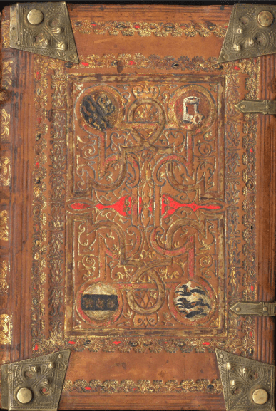
An example of an old book originating from times preceding the 1500s.
The main attraction I had to this image was it’s metallic-platted borders, giving it a feeling of value and adds some additional detail to the story behind the cover.
From this, I would open photoshop and begin working on creating my yearbook cover, using leather templates found online to give the book a leathery texture as a background while adding the metallic-platted corners which were drawn out and colored with an “aged gold” pigment to emphasize the historic look of the book cover. Finally, I had added a plaque in the center of the book for the text of design 1 and the image of design 2. This would provide the viewer with a point of interest in the book and draw their eyes towards it. This would also be colored with an “aged gold” to remain similar to the metallic-platted edges of the yearbook cover. The font would be Times-New Roman as it takes a more formal and historic look to it. The results included the designs that can be seen below.

Design 2
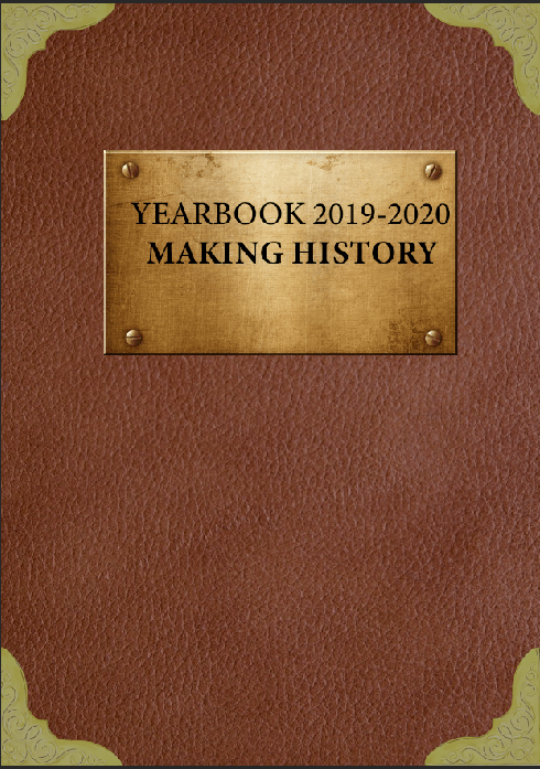
Design 1
These 2 designs would become my submission to the Yearbook cover competition encompassing the theme of “making History”. Personally, I had preferred design 1 over design 2 as it had a bit more of a minimalist aspect to it and wouldn’t feel crowded. Therefore, for my final submission, I would settle for Design 1.